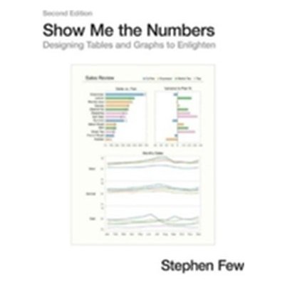
Addressing the prevalent issue of poorly designed quantitative information presentations, this accessible, practical, and comprehensive guide teaches how to properly create tables and graphs for effective and efficient communication. The critical numbers that measure the health, identify the opportunities, and forecast the future of organizations are often misrepresented because few people are trained to design accurate, informative materials, but this manual helps put an end to misinformation.... Celý popis
Koupit za 1 193 Kč- Od nejoblíbenějších
- Od nejlevnějších
- Od nejdražších
 94 %
94 %
Show Me the Numbers: Designing Tables and Graphs to Enlighten (Few Stephen)(Pevná vazba)
Doprava:
39 Kč
1 193 Kč
Koupit za 1 193 Kč
 97 %
97 %
Show Me the Numbers - Stephen Few
Doprava:
zdarma
1 689 Kč
Koupit za 1 689 Kč
 86 %
86 %
Show Me the Numbers
Doprava:
63 Kč
935 Kč
Koupit za 935 Kč
 90 %
90 %
Show Me the Numbers
Doprava:
54 Kč
935 Kč
Koupit za 935 Kč
Popis
Addressing the prevalent issue of poorly designed quantitative information presentations, this accessible, practical, and comprehensive guide teaches how to properly create tables and graphs for effective and efficient communication. The critical numbers that measure the health, identify the opportunities, and forecast the future of organizations are often misrepresented because few people are trained to design accurate, informative materials, but this manual helps put an end to misinformation. This revised edition of the highly successful book includes updated figures and 91 additional pages of content, including new chapters about quantitative narrative and current misuses of graphs--such as donut, circle, unit, and funnel charts--and new appendices that cover constructing table lens displays and box plots in Excel and useful color palettes for presentation
Parametry
| Rok vydání | 2012 |
| Nakladatelství | Analytics |
| Autor | Stephen Few |
| Počet stran | 371 |
| Výrobce | Analytics Press |
| Vazba | Pevná |
| Jazyk | anglické |
| Váha | 1640 gramů |
| ISBN | 0970601972 |


